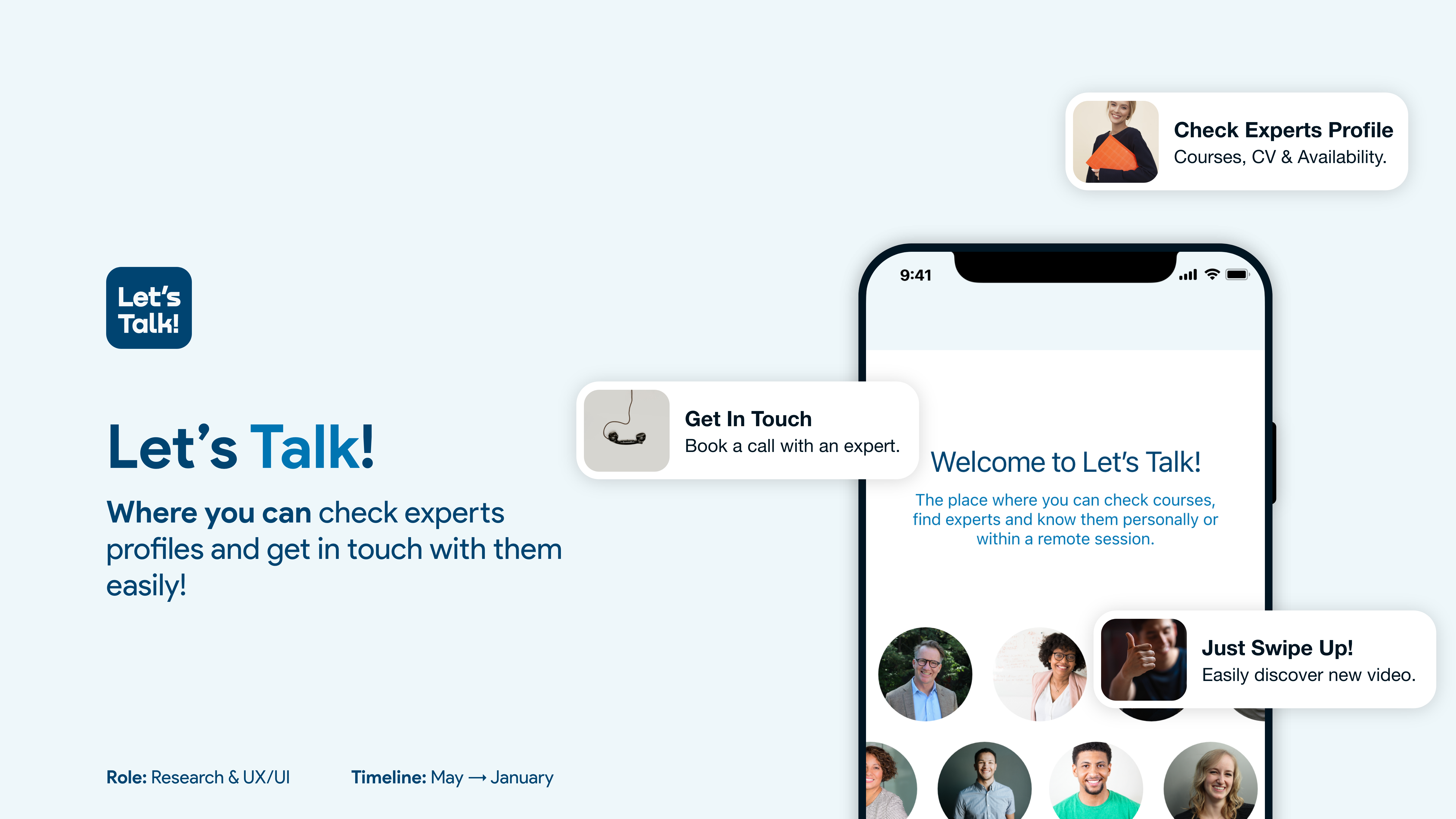
Need more time for yourself?
Overview
Where should you go if you feel overwhelmed, stressed or confused about learning new concepts on an e-learning platform without a community or the chance of getting in touch with the teacher, quickly?
You are likely to abandon ship too soon…
Let’s Talk is a personal project I made into my Career Change @ CareerFoundry.
This cross-platform app is based on the idea of linking e-learning platforms to communication platforms like Zoom or Google Meet. Specifically, having a platform in which users can talk with teachers of e-learning courses.
Tools

THE PROBLEM
Users are getting tired of wasting time during studies on e-learning platforms due to doubts and no-instant feedback.
THE SOLUTION
Let’s Talk App is the perfect bridge between e-learning platforms and communications platforms such as Zoom or Teams.
THE CHALLENGE
Find existing e-learning platforms that want to collaborate or be sponsored, but also find teachers/mentors available to clarify students doubts.
Methods
Competitive Analysis • Interviews • Surveys • Card Sorting • Affinity Mapping • Preference Test • Wireframing • Prototyping

Research Phase
Competitive Analysis
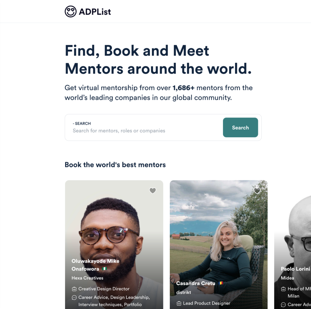
ADPLIST
Amazing Design People List

ELEVTR
Learn from Top expertise live online
ADPLIST
Overview
KEY OBJECT: “ Find, Book and Meet Mentors around the world. ”
The Amazing Design People list was created as a worldwide, community-led talent base to help those creatives who have recently been laid off or furloughed. Get virtual mentorship from over 1,679+ mentors from the world’s leading companies in our global community.
The Overall Strategy is based on People: Community and FREEMIUM Economy are the core advantages of this competitor, having a focus just on a field, Design.
The sessions are live so you can interact with mentors as you would in person.
Definitely, focusing on one field could be a Market Advantage, but couldn’t too.
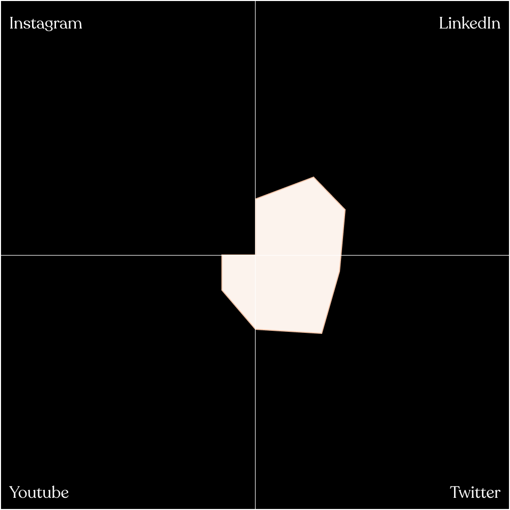
Marketing Profile
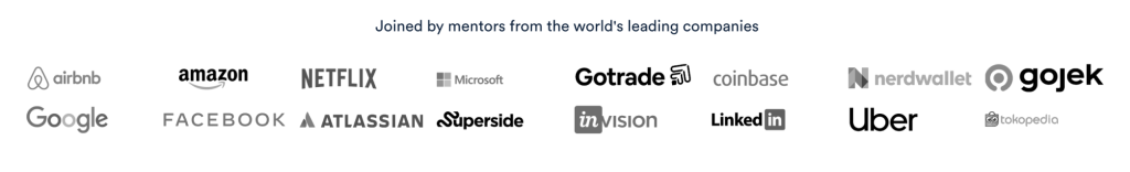
The marketing profile is not the strongest quality of this competitor. On their website are linked the Youtube channel, Twitter & LinkedIn profiles and they are not very present on the Internet. They have an Instagram profile with no posts & where they seem to be “more active” is on LinkedIn.
By the way, at the end of the homepage, before the footer section, are shown that mentors come from big companies and this is great feedback for the users and give to them reliability.
01 Layout
The website’s layout is easy to understand and moving into it seems happening without frictions. The design is clean and minimal, responsive & innovative.
Mobile layout maintains the same feel, but the user avatar & the notification icons are hidden and grouped into a hamburger menu. I disagree with this choice.
03 Differentiation
ADPList is “People-based”. What do I mean?
They have reviews, but not ratings, they suggest you leave a review after each session, they empower mentors with big profile photos and have a cool feature called “Get a match” with which you can find Mentors based on your interests.
05 Compatibility
The website is compatible with all the main browsers (e.g. Chrome, Safari, Firefox).
02 Usability
Finding information is easy. Mentors are put on the homepage and you can visualize them like big Cards with profile photos before anything else.
There are also a search bar & filters to find them quickly. Wishlist, so saving later option is useful but you can’t do that with the group sessions. There is a notification icon there that doesn’t work.
04 Navigation Structure
ADPList is very easy to find on the web.
Searching engine like Google finds the name quickly and it appears like first between about 91.300.000 results. On the other hand, I tried to search elevtr, our second competitor, and it did not appear. What we have are a lot of different results that are not related to what we are looking for.
06 Call To Action (CTA)
Good CTAs, Label & Placeholders. They still remain good on Tablet & mobile versions.
SWOT Analysis
- Clean & Minimal design style;
- Community & People oriented;
- FREEMIUM Economy;
- Asking a question is possible in a more private & professional way in the beginning of a conversation;
- Group mentoring / Q&A sessions;
- Easy to navigate;
- Responsive Website;
- Assistance chat;
- Good CTAs;
- Good SEO;
- Only one Topic;
- Sessions are not done on the ADPList website;
- POOR Marketing Strategy / Profile. They have a Youtube Channel with few videos, the IG channel is empty & not linked on the website;
- Session are only by video.
- Enable instant chat after first message with a mentor;
- Uploading previous sessions into a new section;
- Expand the topic from only Design to IT sector (e.g. Design, Computer Science & Fintech);
- Mobile app & fast videos for learning on the go.
- Learning sites like Udemy, Skillshare & Coursera could be more effective. Youtube is also an important competitor;
- Clubhouse gives the chance to learn and exchange useful informations without show themselves. This could be relevant for someone.
USER RESEARCH
Interviews
At the discovery phase of my project, I conducted user interviews in order to get a better understanding of the problem. Target users for this app will be people from the IT & Design fields. The age range is between 20 and 50 years old because I supposed this is the age people would still learn, even if I know there isn’t a specific age to do so!
I conducted the users’ interviews with 5 people, range age between 25 and 32 so that I could have a good point of view of my target users and start my project in the best way possible.
“As you add more and more users, you learn less and less.”
Jakob Nielsen
Research Goals
- Understand if the users feel they are missing direct contact with the Teacher during a course.
- Understand if a short learning video could be useful (1 to 10 mins).
- Collect data about the context, e.g. while the user comes back at home on a train.
- Determine which tasks the user would like to complete using Let’s Talk app.
Insights
Summarising what I learnt, the following lists are all about key points:
- The e-learning platforms are pretty complete even if someone thinks that there are platforms that don’t know how to sell themselves to the user;
- What they like: see the overall progress, the tasks per week schedule, the small exercises;
- What they dislike: sometimes is difficult to see information (free, payment or if there’s a certificate at the end), too many courses, colours are boring;
- Choose an Instructor means evaluate her/his CV, experiences in the field and credibility
- Choose an Instructor for an area I’m new means I don’t wanna choose a mentor;
- Choose an Instructor means to see the reviews and / or the followers;
- Choosing a course means to see if the course isn’t too long (people are lazy, how it’s presented, see the reviews & the outline of the course);
- In-person is better for long term courses but also to have some extra information;
- Remote is better for short term courses, but is great because you can do it from anywhere, anytime;
Surveys
In addition to the Qualitative data retrieved from the interviews, I started a survey session on Typeform to have Quantitative data to work with and validate my initial research. The people involved was 24.
You can find the result here ↗.
User Flows, No Dead Spots!
After organizing the pieces of information I’ve collected, I built some user flows. This allowed me to verify that there were no “dead spots” and above all it facilitated me in the paper prototypes, wireframes and UI design phase.
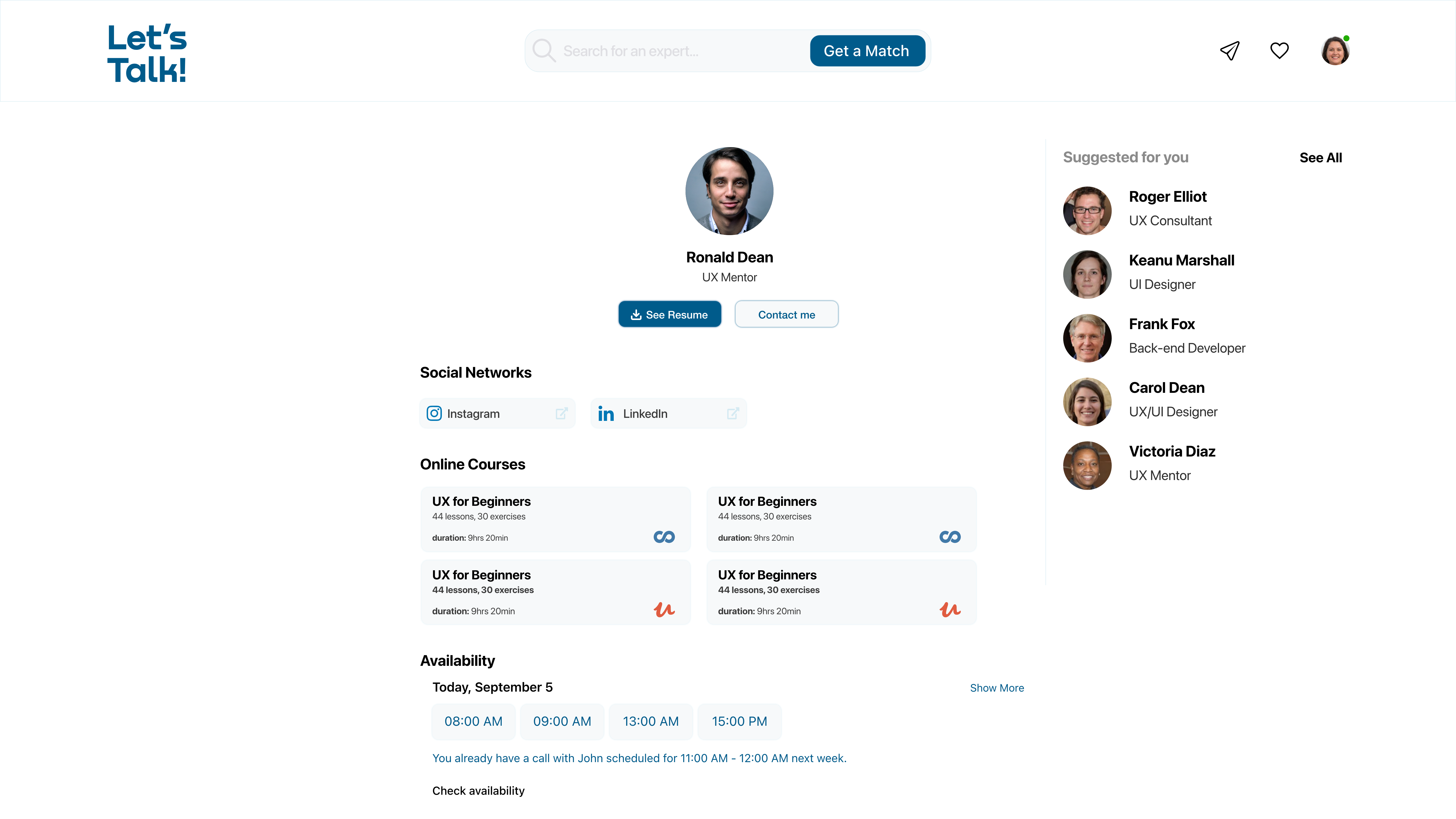
Objective 1: “As someone who wants to get a new job in the IT field, I want to get in touch with Experts by call or video call so that I can have instant feedback and earn more time for my individual studies.”
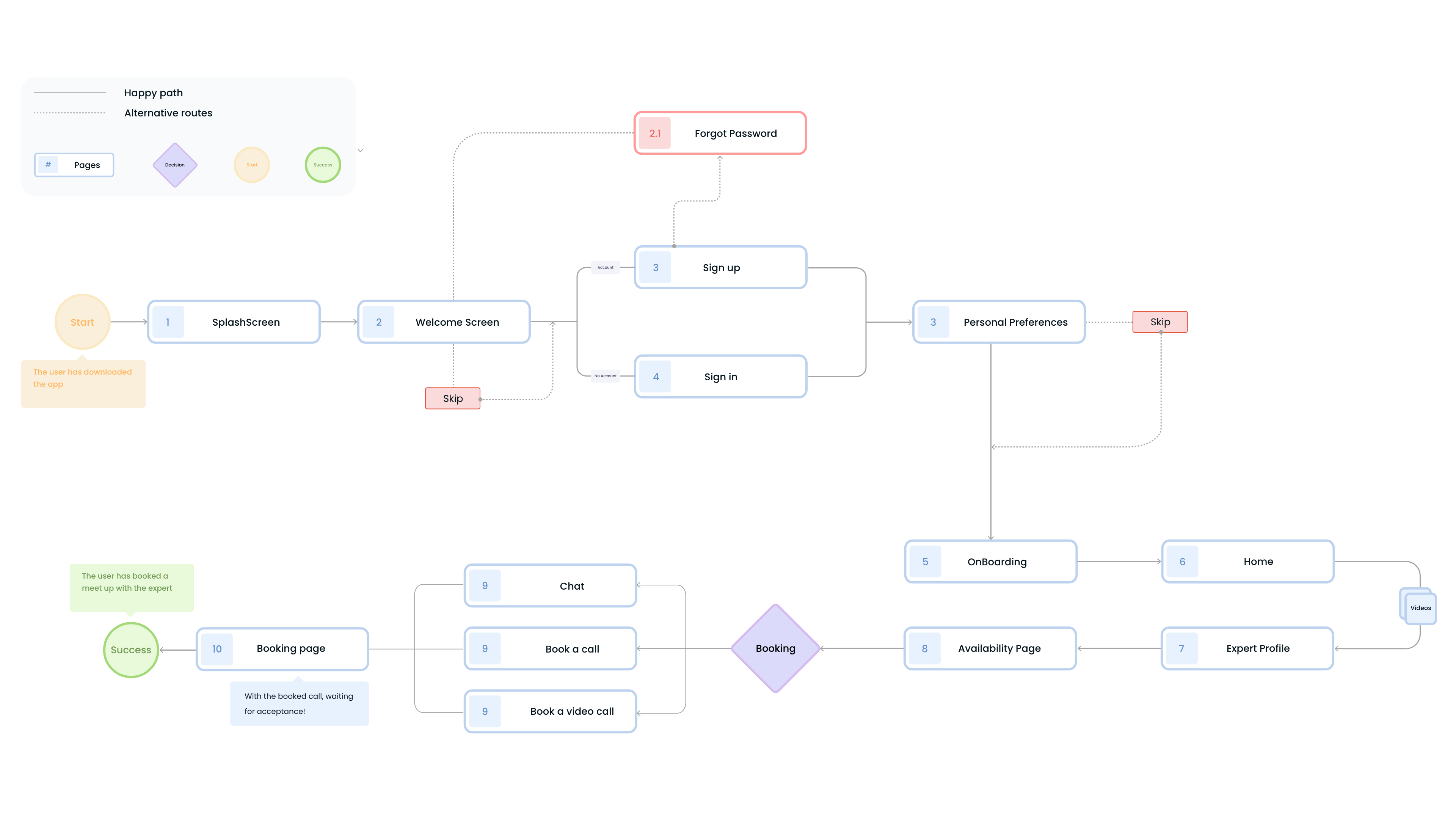
Task flow #1
- Entry Point: Open the app
- See the Splashscreen
- Sign in / Sign up
- Choose Personal Preferences
- Follow the onboarding
- See some videos in the home
- Visit the profile of an Expert
- Check his/her availability
- Book a call
- Wait for acceptance
- Success Criteria: Booked call.

Emphatise & Define
User Personas
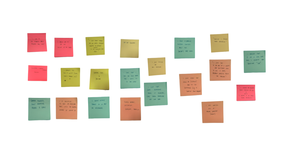
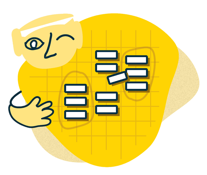
Affinity Map
Analysing all the data I retrieved from the research, I’ve written some insights on sticky notes and grouped them by categories like Teacher, Platform, Dislike, Motivation, Presence/Remote.
This helped me to craft my user personas.

Personas
Based on the interviews I set up two personas. I referred to them throughout the entire product development process so that I can’t get lost or lose focus by the user’s needs.
I used personas to do assumptions in the initial phase of my design process, but I know I need to refer back to them whenever I want to do new assumptions. Of course, assumptions need to be tested too!
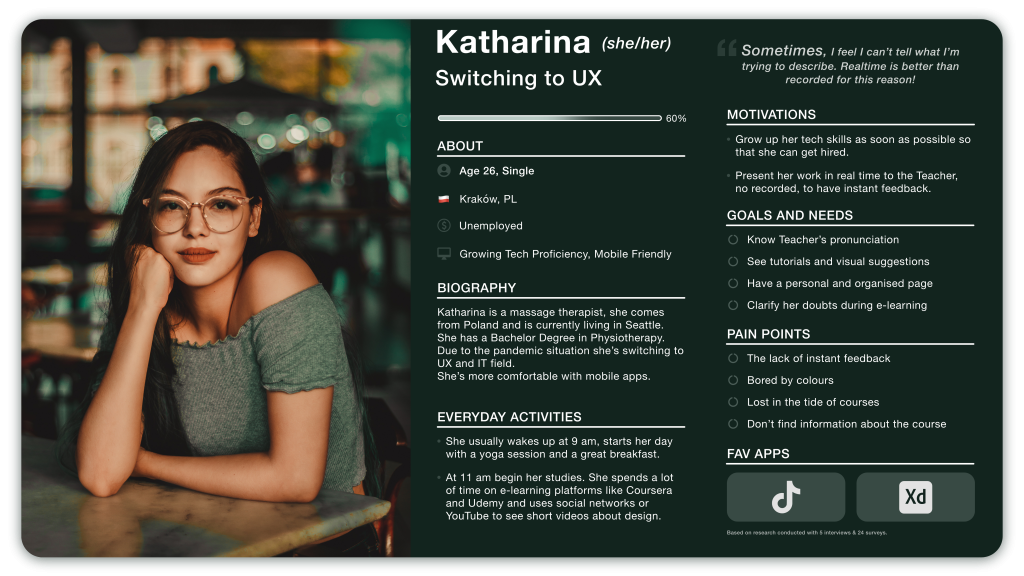
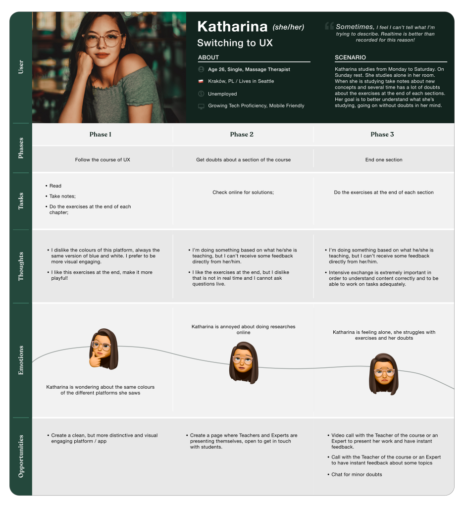
Katharina (she/her), 26
My first persona is called Katharina and is from Polland. My personas are structured in a simple way, provided of context about life, daily activities, a list of goals and needs and some pain points to have a clear situation of what I have to avoid or to solve during my design process. Knowing motivations and the fav apps of my personas helped me to understand what moves them and what kind of interface the user is used to using.
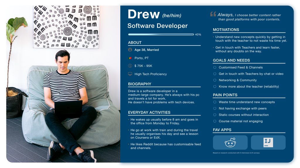
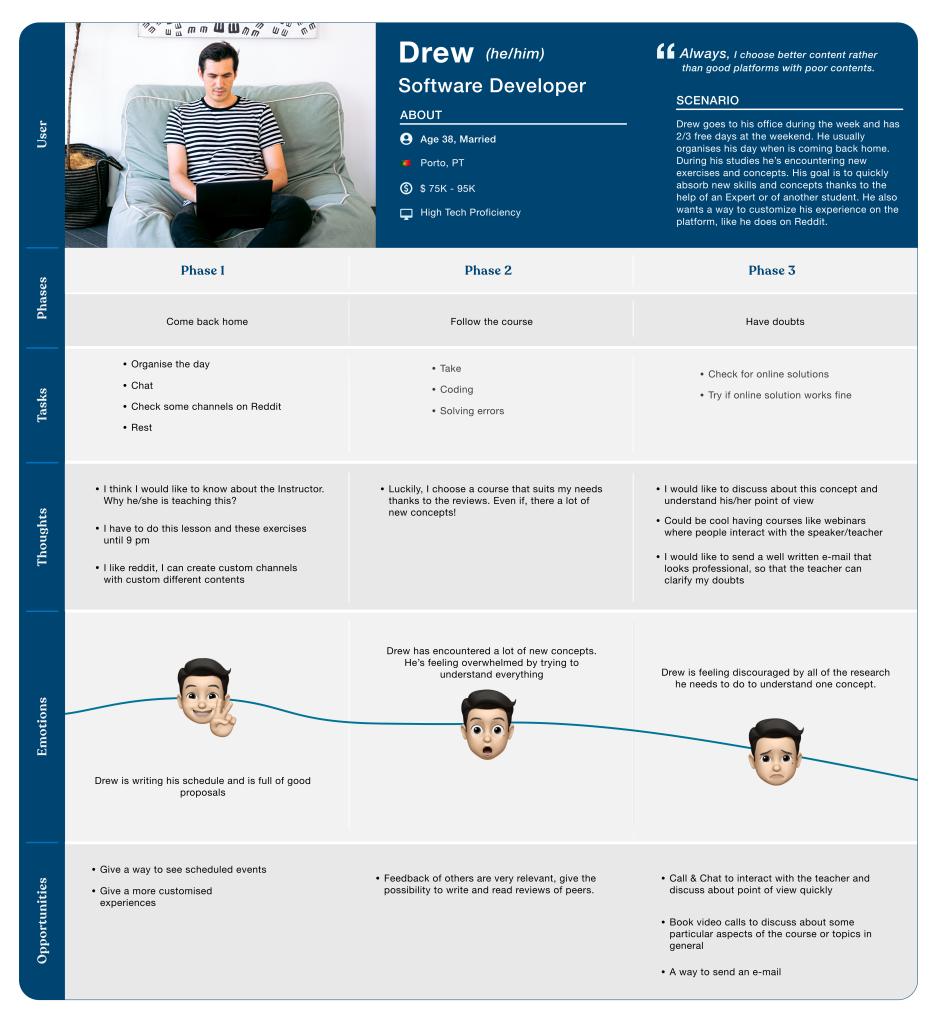
Drew (he/him), 38
My second persona is called Drew and is from Portugal. Thanks to him I know that having a customised feed is important too. For this reason, in the final design of the app, you’ll find the Customising page and the button For you in the Home of the app.
Emphasise with the Users
User Journey
I mapped out the users’ steps to see how I could simplify their journey to help them reach their most important goals with the product.
Both my personas felt stuck or tired during their e-learning course, this happened because they must check for online solutions and sometimes it seems to be very difficult finding a proper solution or quickly understand it.
Card Sorting
To give a better structure to the app, I’ve defined the Sitemap and decided on the main categories with a Card Sorting session. Thanks to OptimalSort I’ve done an online Open Card Sorting. The objective was to discover how people think and group my pages in the Sitemap.
I revised the sitemap with the analysis of the data based on 8 participants, the result is shown below (but for a more detailed version you can go here):
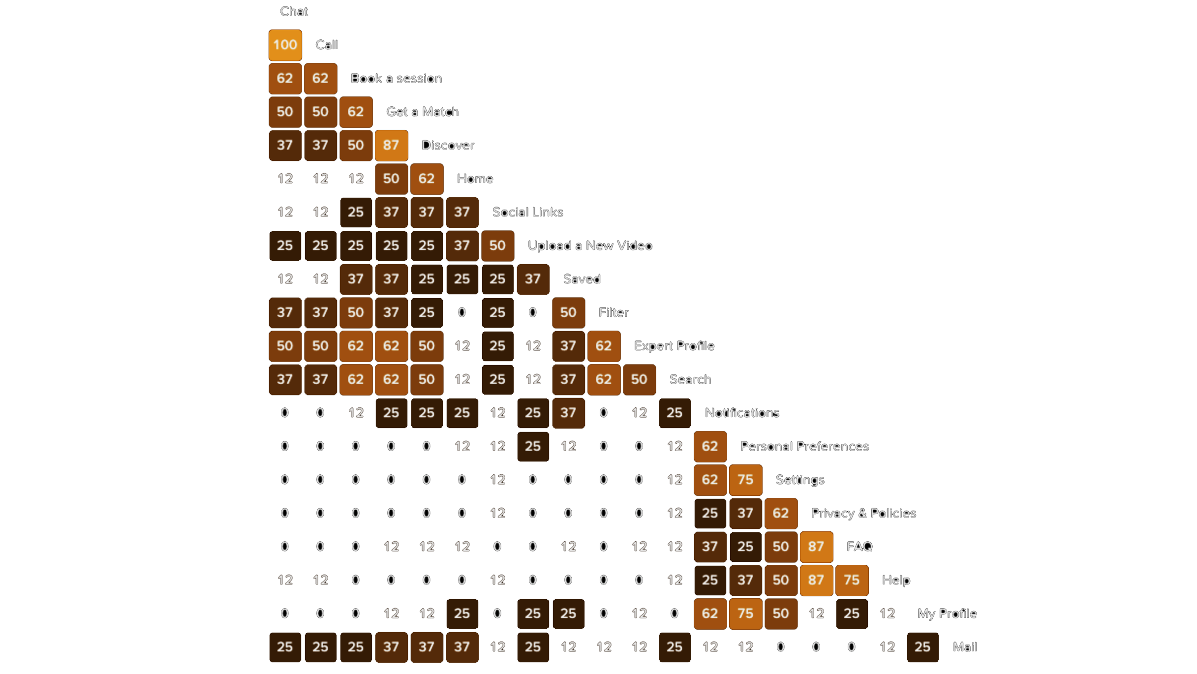
01. Similarity matrix
Thanks to the similarity matrix I saw the exact percentage of people that grouped some cards together. I found really helpful analysing the Categories section too.
I saw the user expects to search and filter results in a lot of pages. For instance, the Filter feature is grouped into categories like Expert, Find Expert (what I’ve called Discover), Favourites (what I’ve called Saved) and Search.
Moreover, the Search functionality is labelled and grouped into Expert, Find Expert, Home and Settings.
At the same time, it’s curious to see how the majority of users put the card ‘My Profile’ with the card ‘Settings’ (5 of 8 users).
At the last, but not least I saw that Personal Preferences was grouped into My Profile, thus I decided to connect Settings under My Profile page to the initial preferences over the flow.
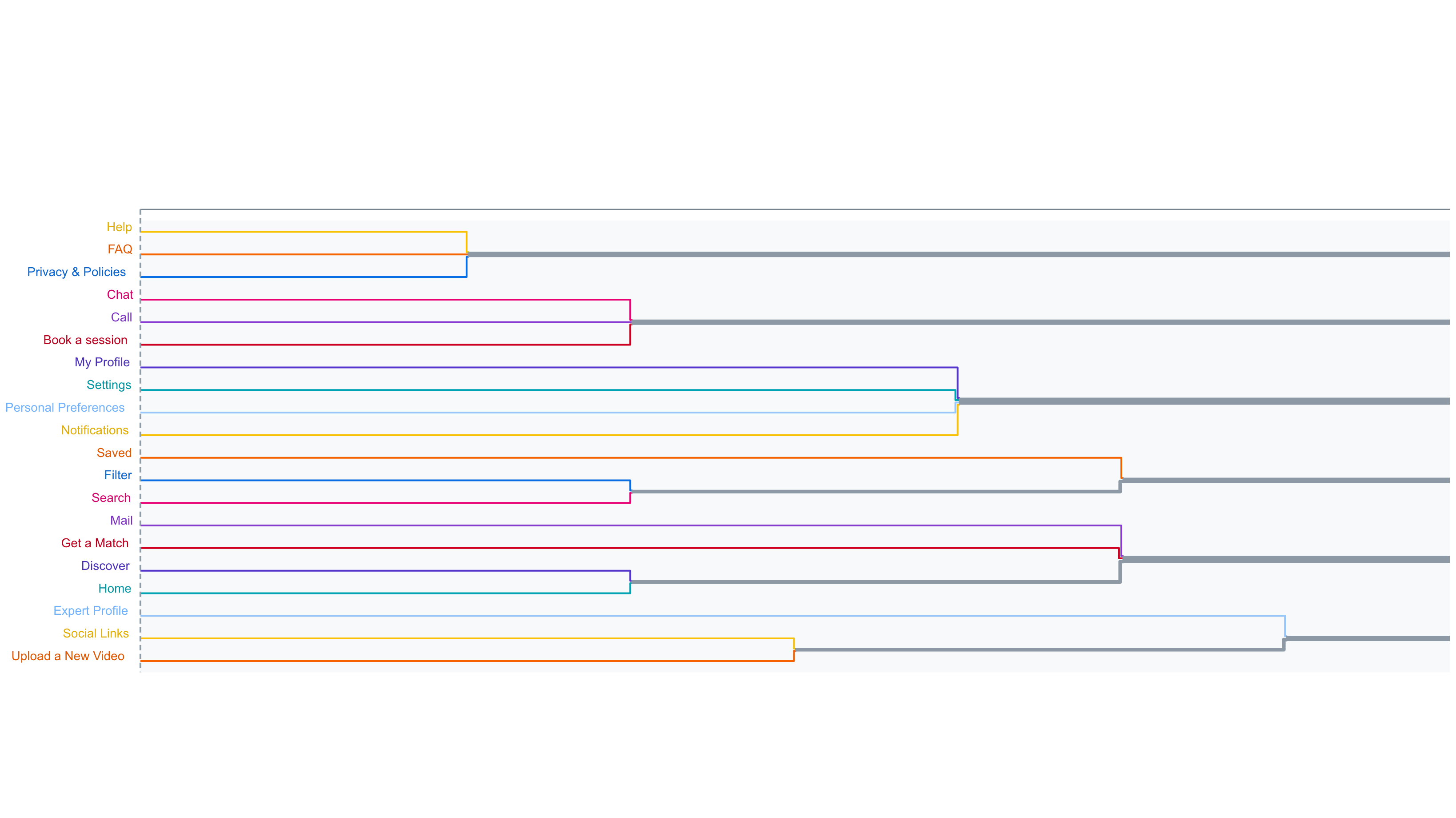
02. Dendrograms
I saw the Dendrograms section to understand how users labelled categories, and specifically, I’ve analysed also each category in the specific section on OptimalSort. The result is this and is useful to understand how they group the cards, I think in the future I’ll do another Card Sorting, with closed Labels to understand if my labels are suitable.
Definitely, Card Sorting sessions helped me to enhance the UX Writing of my app.
Ideate
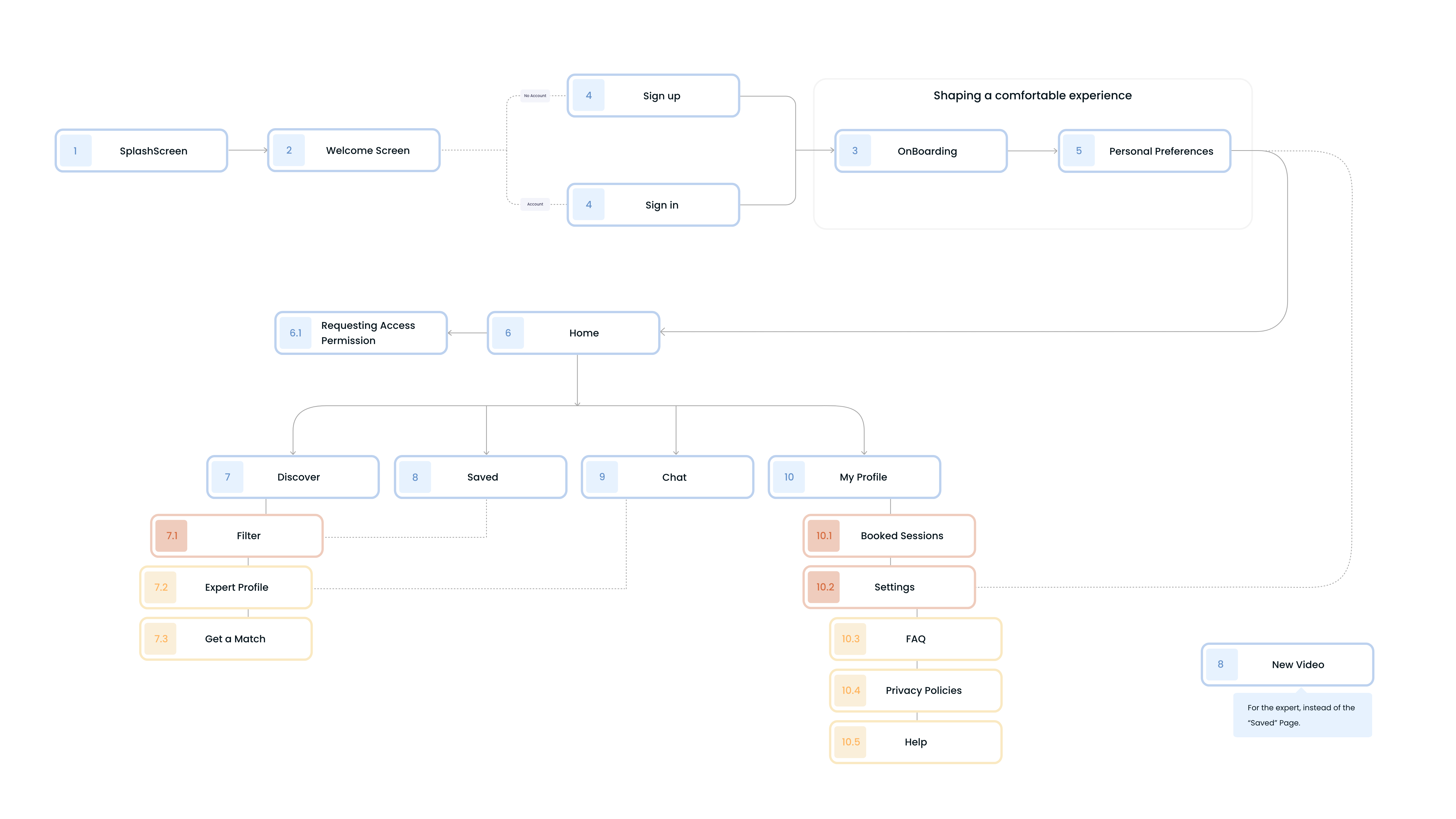
03. Redefining the Sitemap
Thanks to Optimal Sort and the session showed I’ve redefined the sitemap, having more clear what will be the structure of my app and trying to shape a comfortable experience for my users during the overall use of the app.
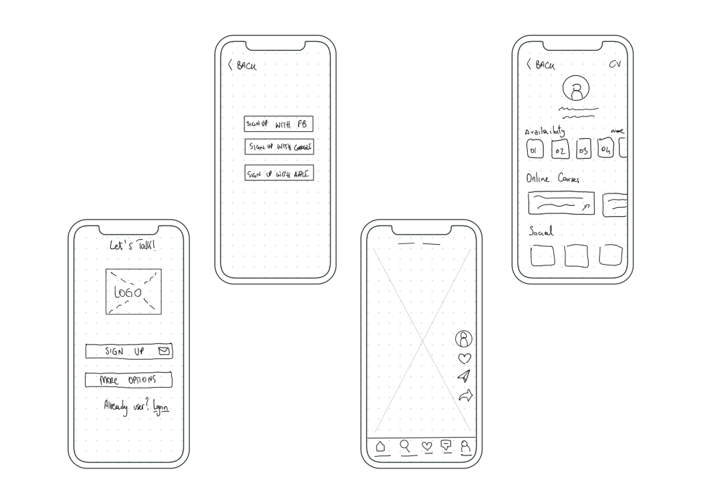
Sketches
I usually start the design process with low fidelity wireframes. This is the way I iterate through many design options quickly without overthinking about colours, font type or size. I usually use printed papers with mobile frames and a black pen, but this time I decided to use the iPad with the Apple Pencil and an app called “Wireframes”.
You can find it here.
Wireframes
Initially, the onboarding process was very poor and not oriented to the user’s understanding of the main features of the app. I found this thanks to the usability testing phase done with my lo-fi and mi-fi prototypes.
At the beginning of my design process, I created wireframes using Adobe XD for testing purposes. With this version, I’ve done my first round of usability tests and I’ve noticed crafting an intuitive interface is important too because too many users during the testing phase had some troubles with the “X” shape over this screen.
First version of the prototype here.
Improving Wireframes
I’ve decided in this first round of usability tests to do some minor fixes to my prototype so that with my future participants I could try my fix as soon as possible and validate them.
Test
Usability Tests
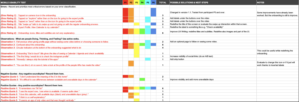
Before launching the product, I did the second testing round in order to reveal possible usability problems. All participants have done 3 tasks. The first and last tasks were successfully passed from all of them, even if they have the same difficulties about understanding what was in the onboarding process. The second task have a success rate of 50% (3 passed and 3 failed). All sessions were executed keeping them shortly, within a range time of 10 mins – 40 mins.
Rainbow Spreadsheet
I did some post-it to synthesise what I’ve found within usability tests. After that, I grouped my findings with the Rainbow Spreadsheet.
Let’s take a deeper look at the issues I found:
- Issue 1: Revisit onboarding process [High]
Suggested Change: Modify texts and images, giving more specific information about features within the app. Also, add a title that indicates it’s the onboarding process.
Evidence: All participants were confused and frustrated about not understanding what they were seeing. In addition, some of them were deeply convinced of something, but while going on in the process they were disappointed. - Issue 2: Expert Videos [Medium]
Suggested Change: Add labels under the right buttons over the video in the home.
Evidence: 50% of the participants were convinced to check expert profile by the “Explore” button in the TabBar or while going on the “Send” button. This must be improved, but I’ve also understood that changing the scenario and giving a direct task was helpful for the user to pass that task. - Issue 3: Home Anxiety [Medium]
Suggested Change: Add a page before going on the home.
Evidence: Two participants were expected to see a carousel of experts to follow before being thrown on the home and seeing videos. - Issue 4: Expert Availability Calendar [Low]
Suggested Change: Change the label of the Calendar to something like e.g. “Check availability”.
Evidence: One participant was sure that by clicking on “View Calendar” within the expert profile, he was checking his availability and not that of the expert. - Issue 5: Lack of Skip Buttons [Low]
Suggested Change: Add a skip button on the onboarding and page “Customise for yourself”.
Evidence: Some participants said that usually, they skipped the onboarding process. On the other hand, the customisation page could be optional and not required to give more freedom while using my app.
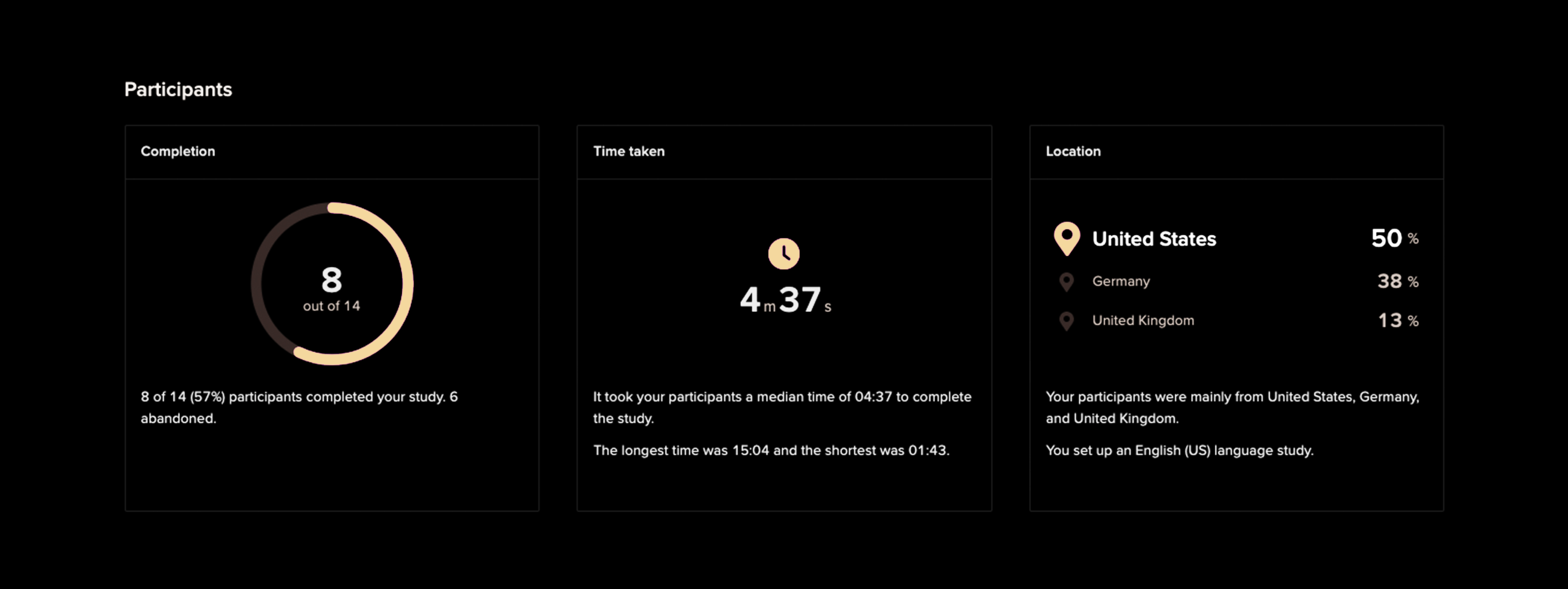
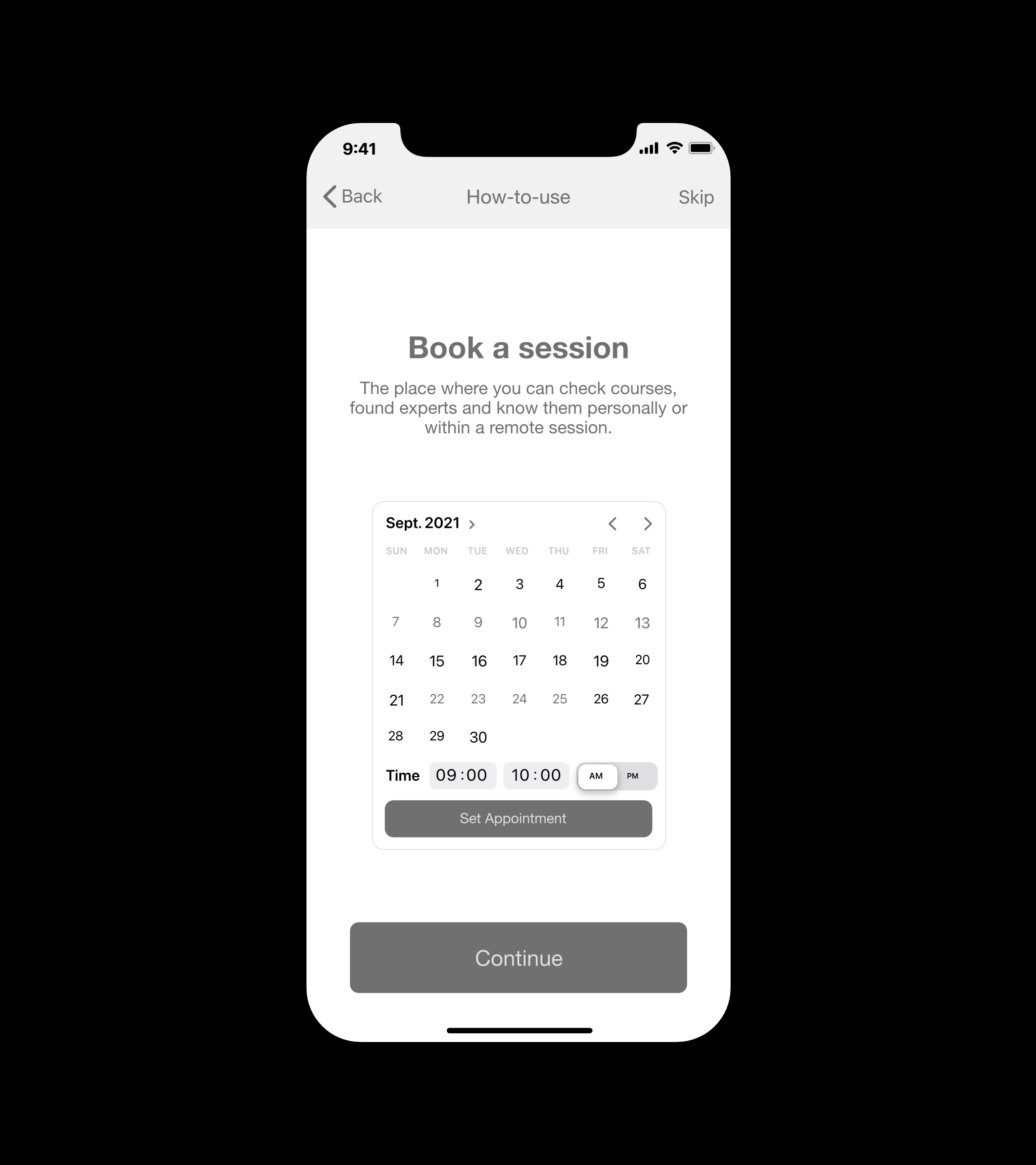
Preference Test
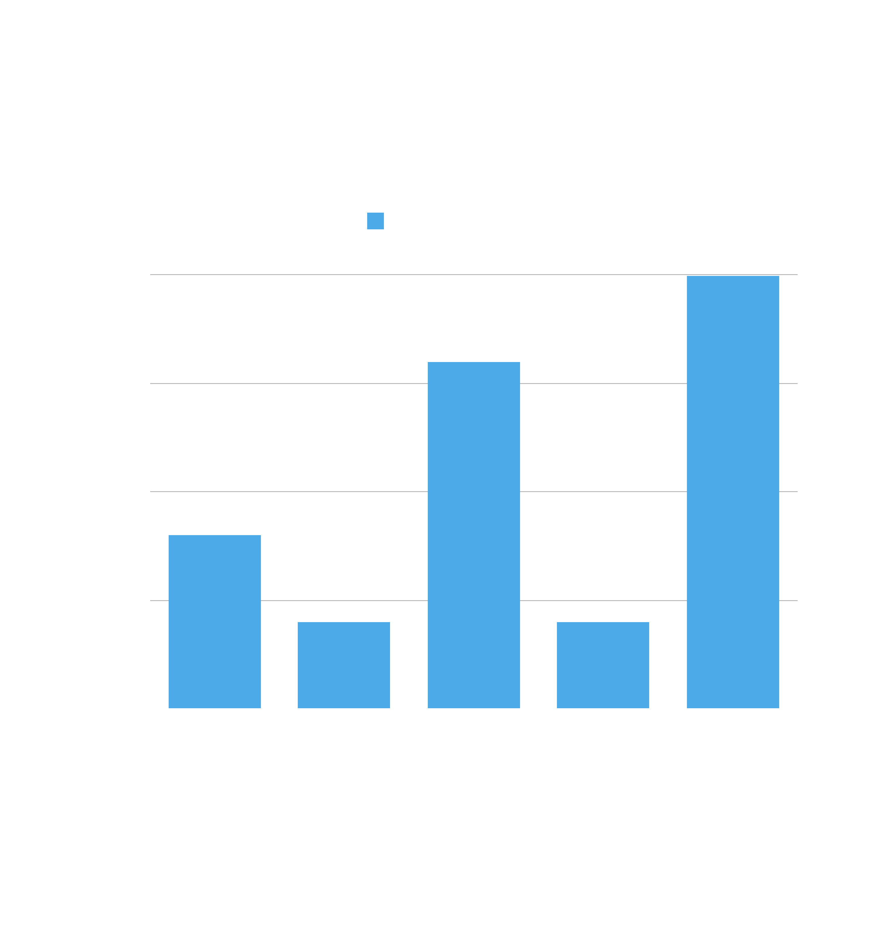
In order to understand my users and enhance my product, I conducted this preference test using UsabilityHub. The tests were conducted between 2 days, 16 and 17 October 2021. I’ve got answered from 13 participants from the United States, Italy, Germany, United Kingdom and Portugal as you can see from the chart. It’s also interesting to highlight that 9 have Apple devices as shown in the detailed test results below. This is relevant because I’m designing first for iOS.
Objective
Understanding where people prefer to have the skip button during the onboarding, but also in general within the app.
We have a Winner
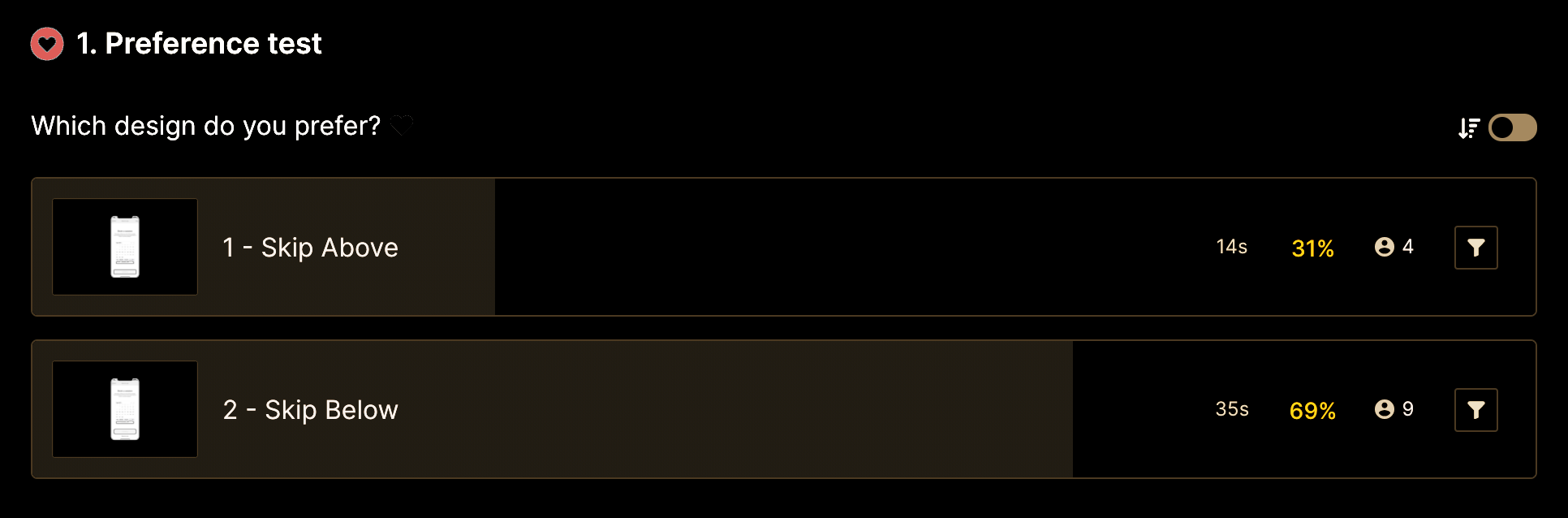
As shown, option B with the Skip button below is performing better, and the difference is 95.0% likely to be statistically significant. The 69% of participants have definitely preferred this one against the first screen with the skip button above in the right corner. Based on a heuristic evaluation, putting the skip button above is better for preventing errors. By the way, for this MVP we will leave the Skip button below as observed from the preference test.
Usability, Desirability & Satisfaction
The first round of usability tests taught me that functional friction can come in the form of bad UX Writing, bad choice of images and icons that could not well represent what users expect to see. While the information provided is exactly what our User Persona, Katharina, is looking for, the real challenge is making that information easily accessible and making the app enjoyable to use on a daily basis. With the benefit of the Rainbow Spreadsheet and Preference Test, I made some significant changes to my prototype that have improved Usability, Desirability and Satisfaction.
Hi-fi Wireframes & Prototype
To make the product more desirable, once I tested out all usability mistakes, I started updating or designing the final screens in Adobe XD, defining visual elements such as colours, fonts, etc.
I defined my Design Language System and tried to design the icon of the app too.
Design Language System
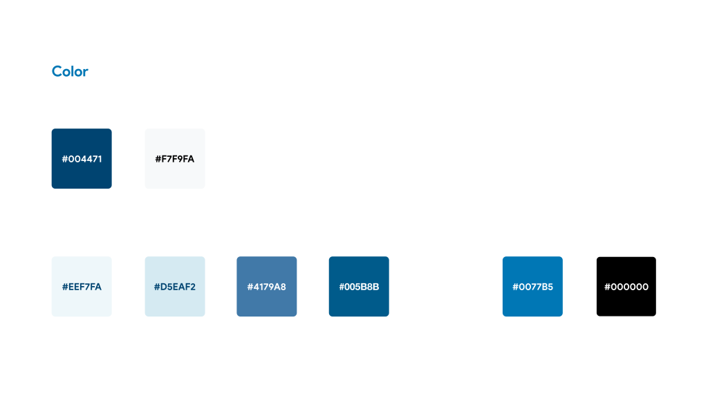
Brand Identity
My Brand uses two fundamental colours: Ocean & Frozen Ice. This gives a great contrast (9.62:1) to the app logo becoming always readable and accessible.
Functional Colors are used for buttons variations and the background of small UI elements.
Accent Colors are used for text, buttons text & links.
Obviously, the choice of Blue as the primary colour was made in function of the colour theory. Blue is the colour of the sky and sea. It is often associated with depth and stability. It symbolizes trust and loyalty.
Typography
The Display typeface is called ‘Nekst’ and the chosen weight is Bold. This typeface is used for the brand logo and a little variation – no colour fill & 2 px of the border – is used for animating the intro screen and simulating the loading process of the app.
SF Pro is the basic typeface used to represent the personality of our app. This typeface, according to the used colours, represents two important values for us: Stability & Strength.
You can use this for every text within the iOS app.
HUMAN INTERFACE GUIDELINES
by Apple
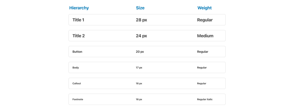
Hierarchy
Defining Hierarchy between texts, according to the Human Interface Guidelines by Apple, gave to the app consistency.
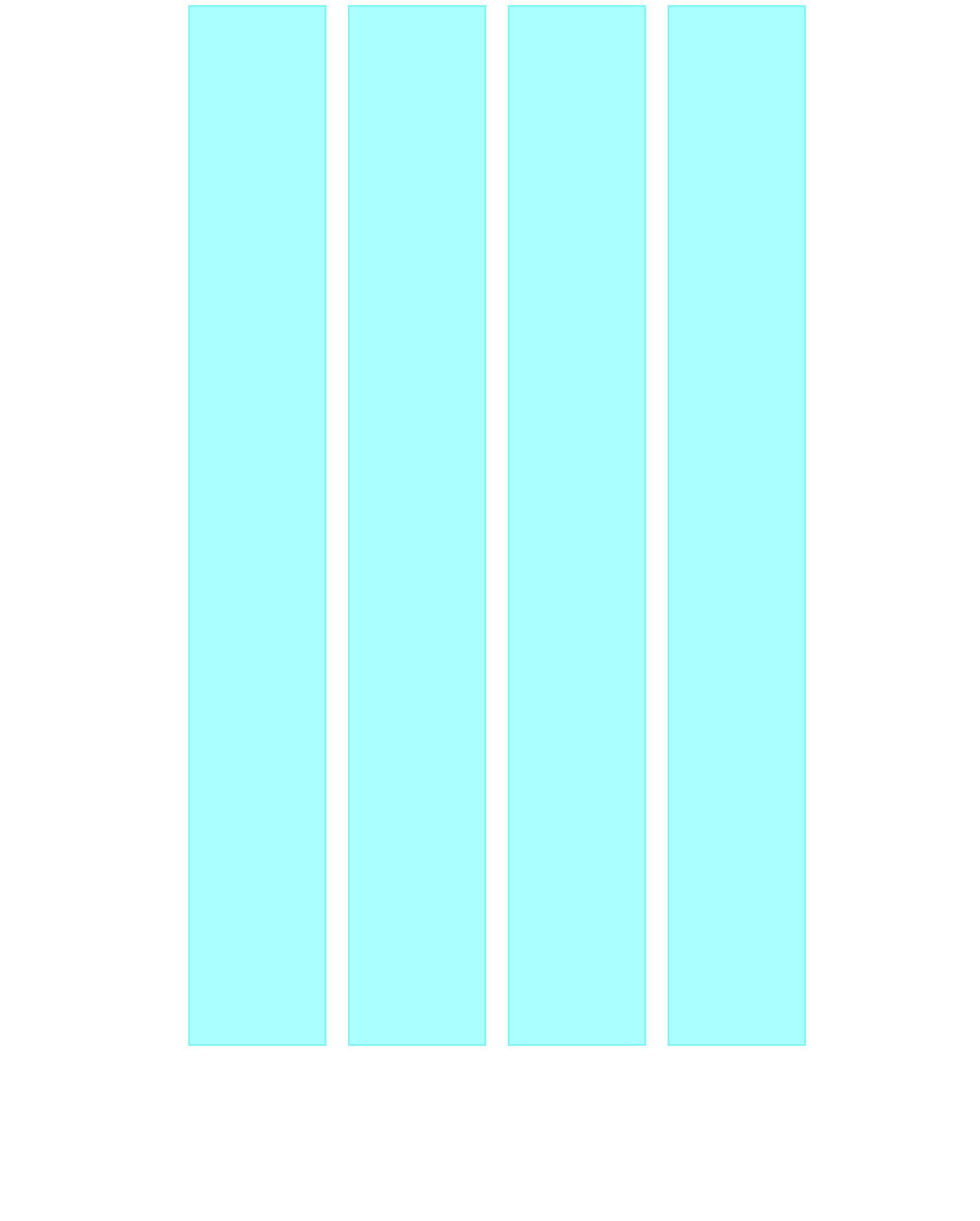
Grid System
The Grid System is based on:
- 4 Columns
- 14 Gutter widths
- 78 Columns width
- 18 Margins Linked
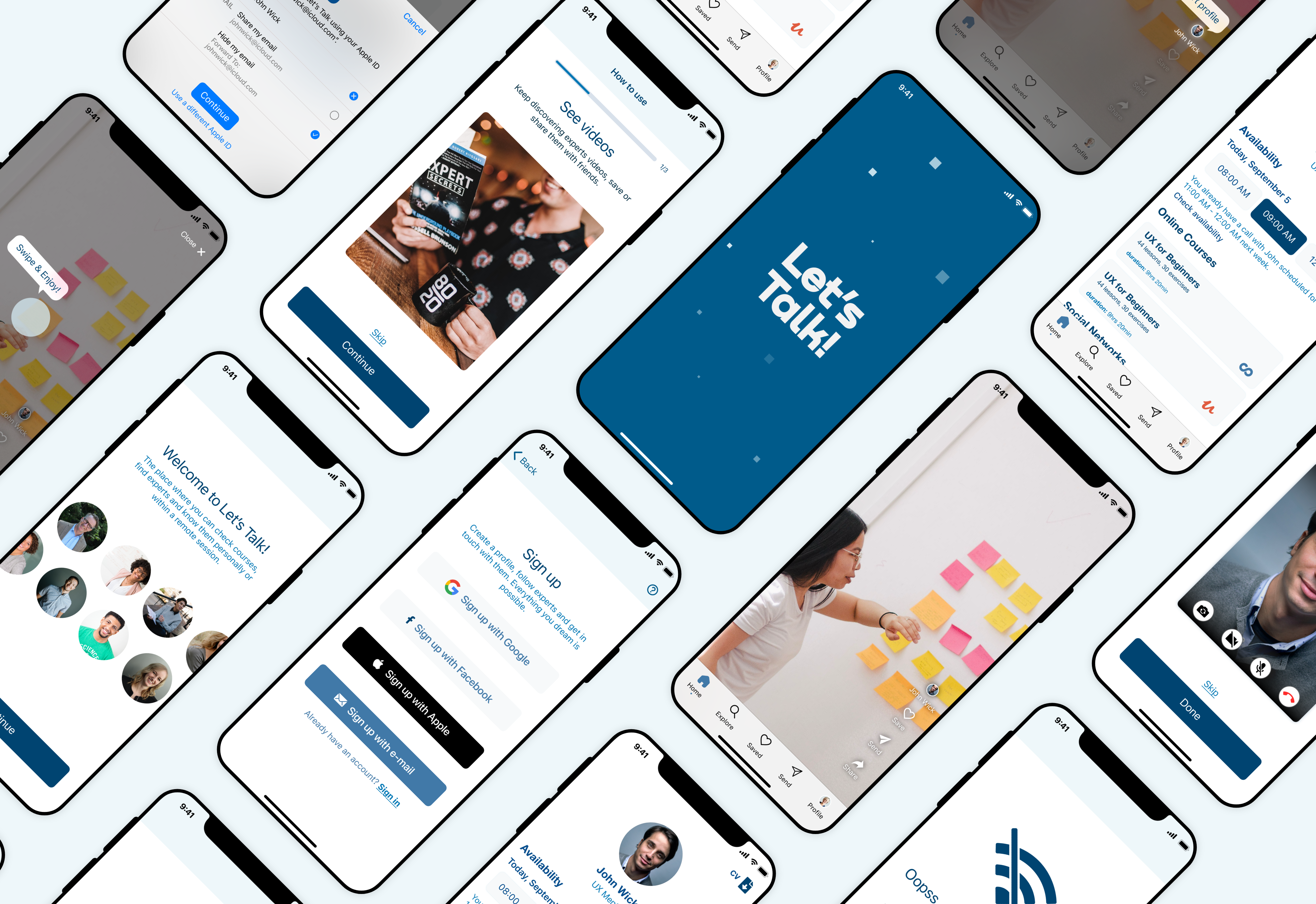
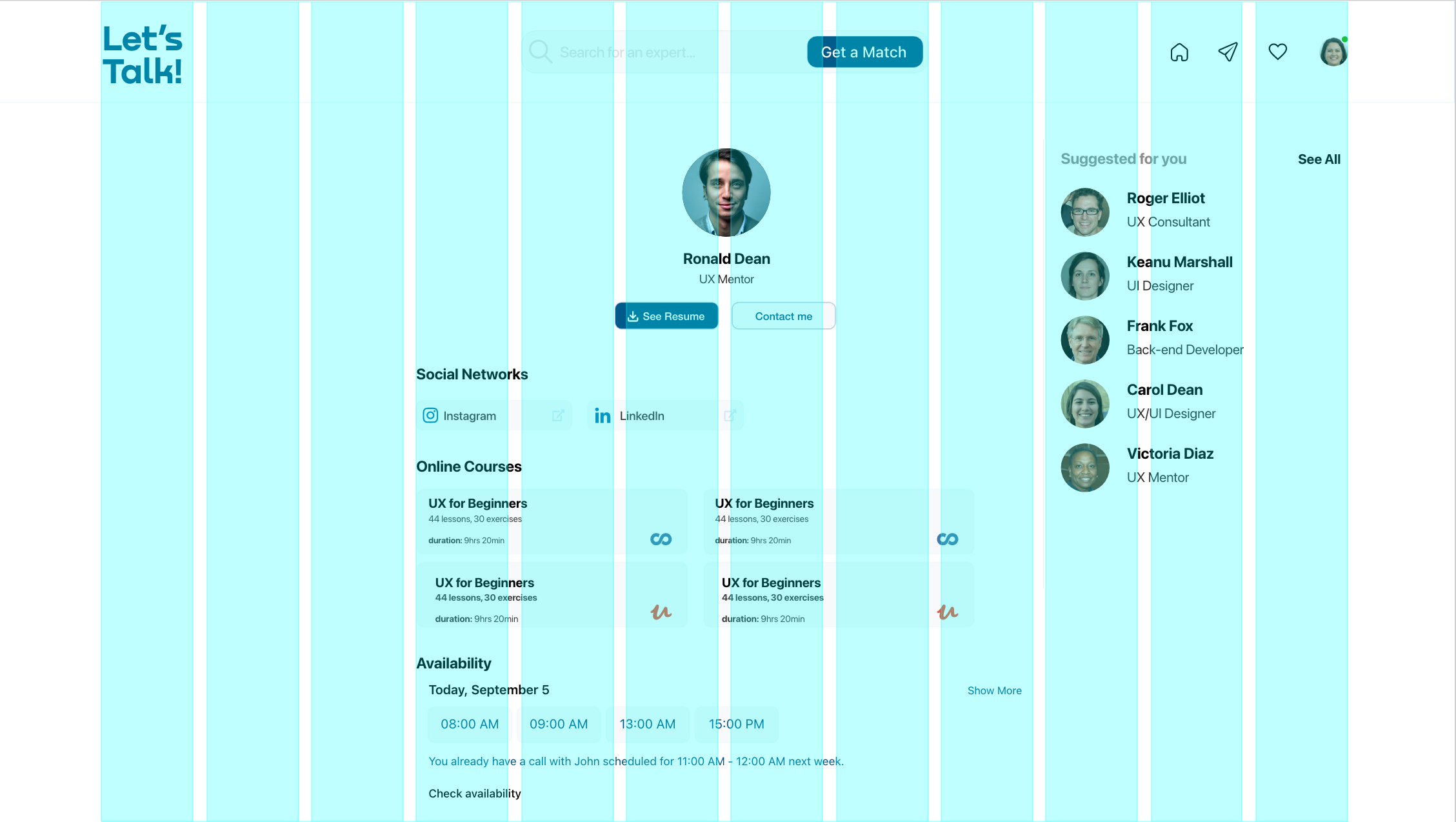
To the Prototype!
Long last, you can now try the final version of my prototype here, after having accepted the Adobe XD cookies. Enjoy it! 🍪 ✨
Future Implementations
Since this version is an MVP, in the future I’d like to design new features already discovered with my research, for example adding some posts in the expert page, the follow button and the opportunity to switch into Dark mode are just some of the ideas came to my head.
Moreover, as the UX process is a never-ending process I would like to improve current features to make them smarter!
Extra 🍒 Desktop Version 🍒
